Uncanny Valley.
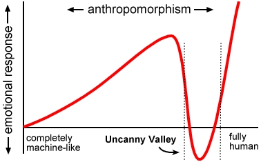
I have always had a very large interest in general on animals and how they move and live. I feel it is more fun to animate quadrupeds as it gives more of a challenge and I feel that if I ever wish to be noticed in the animating industry it will help me more if I show I can challenge myself and step out of the comfort zone. During the weeks of my animation course i have grown a larger understanding of animation and the 12 principles of it, I also have more of an understanding of animal anatomy and how they move realistically. I am trying to reach a point of realism, in which the animal in my animation works realistically but still has a cartoon style. I am trying to keep it in the points of before it reaches the theory of Uncanny Valley; a theory in which if the creation looks too realistic it becomes more unrealistic to the eyes of the audience. An example of Uncanny Valley would be the fact that if you have a robot that has been worked on relentlessly to have as many human aspects and traits as possible, the few aspects and traits missing become almost impossible to not spot and call out on. This is reaching that state called Uncanny Valley which can lead people to feel unsettled or disturbed. The reason for this reaction is because it is more easier to pick out things that are off about an almost perfect human simulating object that can lead you to think: "It is human, but it is not." But if you go to the point of just before Uncanny Valley where for example, you have a robot that is very clearly a robot but has very few human aspects and traits, this is seen as more appealing to the audience, and my main idea on why is because it can be seen visually that it is very clearly NOT human but the fact it has human traits makes it seem friendly because it is easier to understand. Here is a graph on the uncanny valley.
 |
|
The graph helps to show that the less human it looks the more it is liked, till it reaches the point of Uncanny Valley where it is so human like it becomes disliked by the audience, but then the likeness of the creation can go back up once it becomes almost practically a living human with few errors. Here is examples of just before Uncanny Valley and then Uncanny Valley.
 |
| Uncanny Valley. |
 |
| Before Uncanny Valley |
As you can see the robot looks so human now that it is easy to pick out the things odd with in the creation. Every human is use to seeing a human, they see humans everyday. So when faced across something in the Uncanny Valley point it can be unsettling because humans know what to expect from other humans, and Uncanny Valley creations just are always a few steps away from being able to do those thing expected.
As you can see here the robot Wall.E from the animation film is cute and considered loveable and friendly, as it is seen by the human eye that it is very noticeable that it is NOT human and very much like a robot. But the fact it thinks like a human with emotions and expressions it becomes loved as it just before the Uncanny Valley hitting point.
The Uncanny Valley is something i try to avoid in my animation by the fact my character needs to work like a realistic bear in terms of movement, but i want his face and expressions to remain cartoon and stylised keeping it just before the point of Uncanny Valley.
Here is a link to a youtube video i watched that helped gain more knowledge on the Uncanny Valley, and where i got most of my help to learn about it; https://youtu.be/9K1Kd9mZL8g
Eadweard Muybridge
I have also studied work from a man called Eadweard Muybridge, who was born the 9th of April 1830.
He is an example of his work;
He managed to capture the first ever frames of a horse during gallop and begin the success for animators and artists alike. He successfully proved that horses lift all hooves off the ground during the process of galloping, and it became world famous. Because of his work animators was able to work more realistically when it came to moving an animal during frames and began the theory of Uncanny Valley through animation. He has done numerous work on many different animals and how they move, he also tested capturing frames of humans moving in different angles all at the same time, which helped to give an idea of how the eye of audience focus on a character of importance during the work of an animator today. He was the inspiration for many artists at the time and helped them to make their own paintings look more realistic, here is some more examples of his work.

 He worked on different angles such as the example of the elk on the right, showing the movement from side view and then front view while running away.
Here are examples of his work moving;
 |
| Horse Running. |
 |
| Cat Running. |
 |
| Elk Running. |
I am hoping to apply all of what i learned from these two subjects to my animation and the character i have chosen to animate in hopes that i can make it move realistically and correctly while keeping my own style to it.
Realism & Physics
Realism and Physics play a big part in animation, specially when it comes to what type of animation you're planning to achieve. It also plays a big part in games, as gams often get noticed through the graphics and physics of gameplay. If you look back to old games such as the first released games of Mario the graphics are very outdated compared to outstanding games such as Until Dawn. Both these games are very different when it comes to the graphics and physics which helps to determine how realistic the goals of the game were.
For example;
 |
| Mario |
Mario was very basic in terms of graphics when it first came out, it had a very blocky and pixelated style. Yet even now the game is still loved and you can often find that people will play these games still as it has become its own style of art. But the reason the game became so popular was because it was at the very border line of realism, having a small man be able to grow through eating a moving mushroom was very unrealistic, but the physics is was kept it real, he did not grow into a giant, more just into a normal sized man. Physics and graphics go hand in hand sometimes, as Mario had blocky graphics which took realism out of it in terms of looks, but kept some in with the fact that you could in fact still detect he was a man and human, so the graphics did not cross a point which made the audience then think "Well what is this guy supposed to be?"
You will often find people play games such as this now to get a nostalgic feeling; which often makes them remember when they were young. You don't often get games like this anymore despite the fact some game designers bring games out with this art style specifically for that nostalgic taste. But if you forget the graphics for this part and think entirely on the physics the game is in perfect sense. Mario the main character can do all basic human things, run, jump, climb. He does not over step the boundaries when it comes to this, he can jump a reasonable height which increases a bit when he has a mushroom to grow, he climbs at normal pace and runs at normal speed. These factors kept the game realistic in terms of human capabilities. But Mario took a different turn when you could sometimes find a star which was suppose to be a helping item, it would make him glow (often rainbow colour) and basically defy all human capabilities. He could jump high, run very fast and climb very fast, he also could not get hurt and would often take down an enemy just by touching it. this small factor that broke all natural law of physics and limitations is what gave it a more fascinating feel, because even with this unrealistic possibility the realism was brought back to the audience when it was found out that the stars influence only lasted a limited time, meaning it was not a permanent power. It was to be used sparingly and you was to ration it in someways, which then pulls back into the realism things that nothing lasts forever and you have to be careful.
 |
| Until Dawn |
Until Dawn, is a very different game compared to Mario. It shows drastically over the years how games have progressed in terms of graphics and how real games can look. Until Dawn explored and dived deep as they could when it came to making the characters look real as possible, the emotions and expressions are seen clearly and excellently in this game and the lips move in time with the actual actors voices. The realistic look is what adds the horror to this game, because at first you see amazing realistic humans and animals and it does not cross the boundaries and physics of natural law. But as the game goes on you find these creatures called Wendigo which realistically look terrifying and break the laws of natural physics as they can climb extremely fast, move extremely fast hear things extremely well and over all are just horrifying, the way the creatures move are against physics too as their limbs are very bendy and twist a lot of the time. Until dawn achieved such a great horror through the ultra realistic graphics of the humans and Wendigo as well as the incredible physic breaking abilities the monsters have.
Basically all this applies to animation too, for if you want an animation based off realistic creatures and humans and such the graphics must be real enough to notice and physics must be believable. So I am hoping to apply these things to my own animation too.
Photo Realism vs Stylisation.
Photo Realism is a style of art and sculpture characterised by the highly detailed depiction of ordinary life with the impersonality of a photograph. for further explanation it is basically a detailed visual representation, like that obtained in a photograph, but actually in a non-photographic medium such as animation or computer graphics.
Stylisation is a type of art which is represented in a non-naturalistic conventional form, meaning it is based of a natural or realistic thing but given clear difference, for example the classic and generic heart shape often used by many people around the whole world which represents a heart in context but not realism, it is stylised as it not the same as an actual representation of a human or for that fact any living creatures heart.
Examples of Photo Realism;
All of the art shown here is by
artists that have tried to capture
realism in their designs, which
you can see from the details added
to it and the effort put towards keeping
everything accurate and proportioned correctly.
Lots of effort has been put into these designs and it can be seen clearly how much effort has gone into it as the details given to give the realistic touch stands out greatly, to the point where if you was to take only a quick glance you would probably think it is an actual photograph that has been captured rather than being created.
These designs show results of a correct and accurate scaling in the style of Photo Realism, it shows how everything has been scaled to the correct sizing and detailed in the right ares to help give off the realistic effect.
Examples of Stylisation;
All of the examples here show perfectly what stylisation looks like
as every painting/drawing is representing something real that everyone knows about but has been drawn in a completely different way and has been given a new look.
It does not focus on realism and accurate scaling of details, as yes they are detailed and made to look very unique and beautiful but detailed in terms of capturing what is known as the realism of the image is not there.
 The butterfly is clearly a butterfly in yet it is not realistic in any terms as it has been given almost a flora like detail to its wings and of course is very multi coloured which gives it, its stylised look.
The same goes for this pig, it is clearly a pig as you can see,
but is no way realistic with how it has been drawn, its been given
The best example i could find is of this strawberry, it shows the photo at the top left, letting you see how it looks in its natural and realistic form, and then as the squares progress it shows the artists stylised designs of clearly the strawberry but made to look very different and unique.
Comparison (Paintings & Animations)
As you can see there is a big difference between Stylised and Photo Realism, but both designs are beautiful and hold there own talent.
 |
Stylised
(Animation) |
Between both animations of animals you can see the Polar bear has been worked on to move realistically and accurate as possible, looking at the legs and joints you can picture a polar bear actually moving like that, where as the deer is stylised as you can see the drawing looks more cartoonish and the legs bend very unrealistically you do not see the joints properly and his legs look kinda jelly like but you can see it is still a deer.
 |
| Photo Realism (Golden Compass) |
 |
Stylised
(Painting) |
Between both paintings you can see the woman to the left is realistic and accurate, she looks very life like and the proportions have been met perfectly to display the most life like image you can, you can imagine this as an actual photograph. On the right though you can see the woman has been stylised with different colours and markings, it still shows a woman but it has been styled differently to look unique and out of the ordinary.
In my animation i am hoping to achieve a stylised look of a polar bear, keeping the movement real but the visual design stylised as i want him to look slightly cartoon like and very much like just a drawing coming to life.
 |
| Photo Realistic (Painting) |
Movies That Inspire Me;
 |
| The Lion King |
1. The Lion King (Disney)
What if the artist used different material?:
It would not have the same affect on me because the reason i love The Lion King so much is because of the drawn art style, It inspires me to try and draw like that with my creations.
Does your opinion about the artwork change the longer you look at it?:
No, it does not change, i admire the style always. Because i love the art and how it looks.
Comparison of the art in The Lion king to mine:
To me personally i feel that the art style in the Lion King is better than my own because it has good proportions for the animals and has very charastic and stylised designs for each characters face. Something that i struggle with, i believe in comparison The Lion King art style is better overall.
How would you describe the film to someone whose never seen it?:
The Lion King is a beautifully drawn animated film of a struggle of a young lion cub having to face his haunting past in order to be the rightful king in the future and take back the kingdom from his evil uncle. The art is beautiful and each character has its own individualities to personalise and stand out against one another.
2. Spirit Stallion of the Cimarron. (Dreamworks)
 |
| Spirit Stallion of The Cimarron |
What if the artist used different material?:
I would not like the film so much because the main reason i love the film is because of how beautifully done the animation is with the drawn art style, and how accurate and outstanding the details are.
Does your opinion about the artwork change the longer you look at it?:
No, it does not change. I love the film and always will because of the art style and the design that has been made in thew film with the animation to make it stand out.
Comparison of the art in Spirit Stallion of The Cimarron to mine:
To me i do not feel that my art is as good matched as the art style in Spirit because the drawings are very accurate when it comes to horses shape of his face and body and movement. It inspires me though too improve my work.
How would you describe the film to someone whose never seen it?:
Spirit Stallion of The Cimarron is an amazing animated film of a wild stallion who gets taken from his herd by old west american soldiers, only to go on a life changing journey to break free and find his freedom with the help of a young indian rebel by the name Little creek. The film is beautifully done with animations and the art style is fantastic.
My Favourite Artist That Inspires Me;
SumikoOneesan(Youtuber)
 |
| Example of work By SumikoOneesan |
What if the artist used different material?:
I would still like them and there art as they have used different apps and different artistic approaches on many different things such as youtube, deviant-art, instagram etc. And used different softwares such as artistic phone apps, photoshop etc.
Does your opinion about the artwork change the longer you look at it?:
A little, i can see as the years go by that there art is becoming outdated as they stopped creating small animated films a very long time ago, and add the years have gone on there design has become outdated compared to other new upcoming artist, but i still love their style nonetheless.
Comparison of the art in SumikoOneesan to mine:
Compared to mine and her art, they are both very similar as she heavily inspired me to start drawing animals in the first place and i used her designs for templates to practice with, so a lot of my drawings can be compared to hers very easily, but still i feel she gets the faces done better than i do.
How would you describe the artist to someone whose never seen or heard of them?:
She is an amazing artist who done short animated films, which she created every scene herself with no help. She is very talented and is fantastic at drawing animals.
End.


